LinkedIn contains a lot of your professional history, connections, and engagement patterns, but most of this valuable data just sits there unused.
With Claude 3.7's new capabilities, particularly the extended thinking mode, you can transform this raw information into interactive dashboards and visualizations that actually tell you something useful.
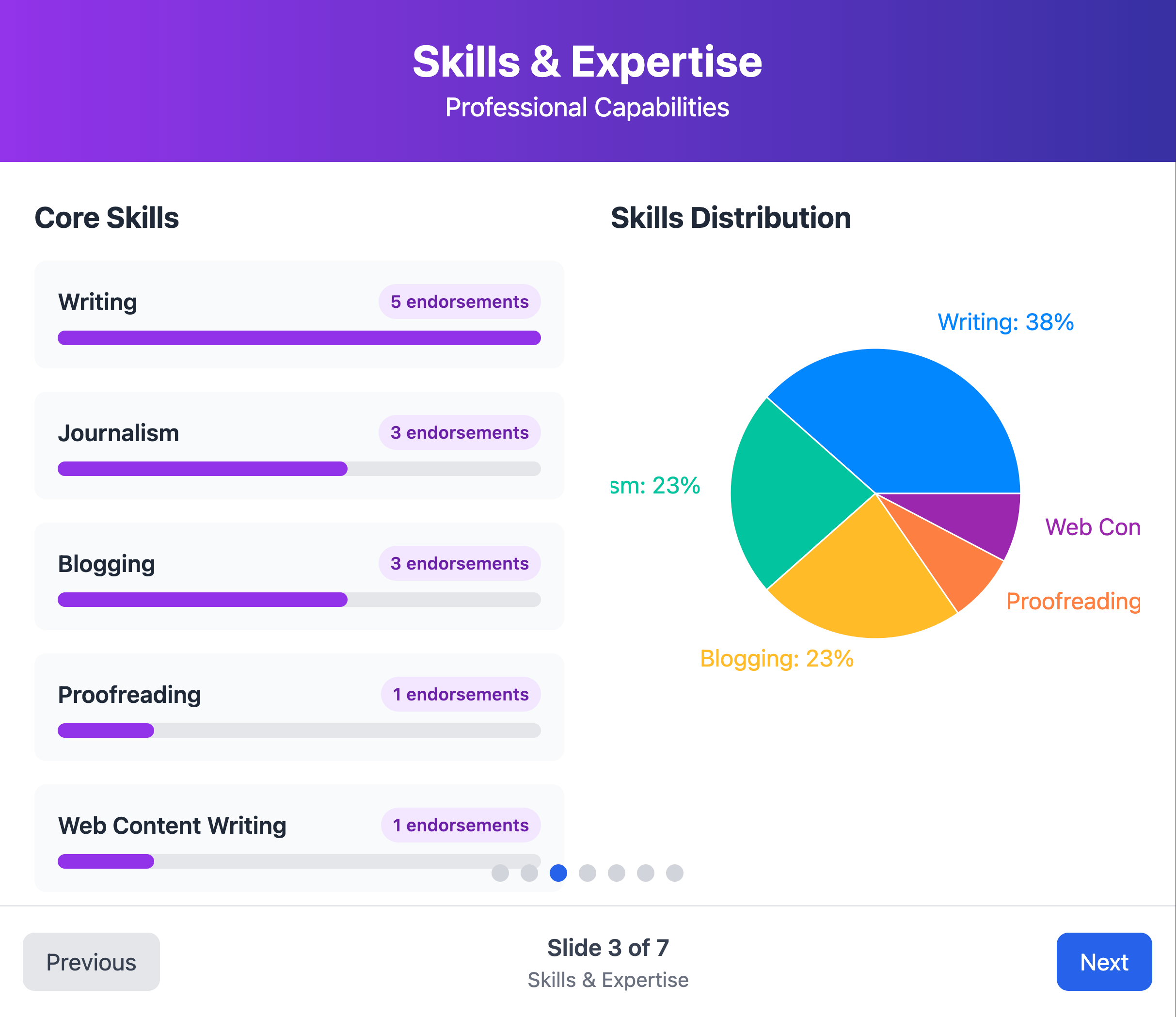
Like this:
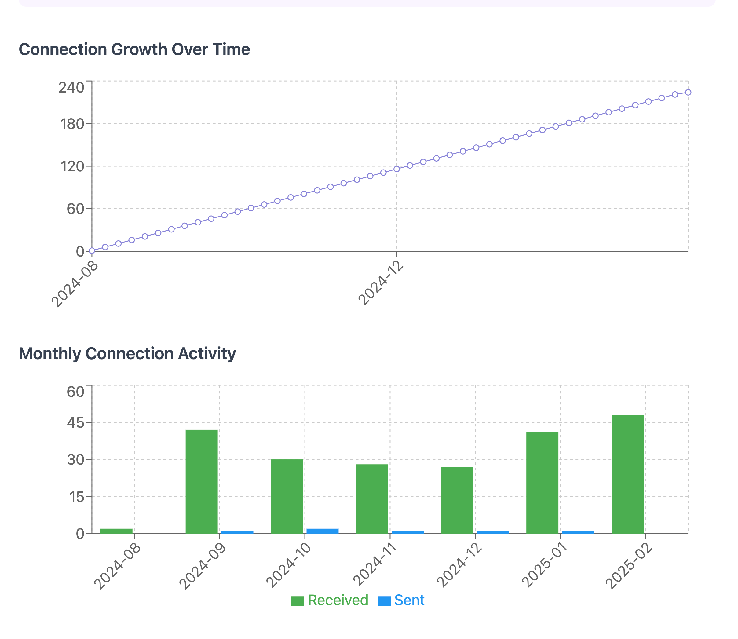
Or this:
What's nice about this approach is that it requires zero coding knowledge, works with the free version of LinkedIn, and creates shareable visualizations you can use in presentations or reports.
I've been experimenting with this technique, and the results have been really insightful.
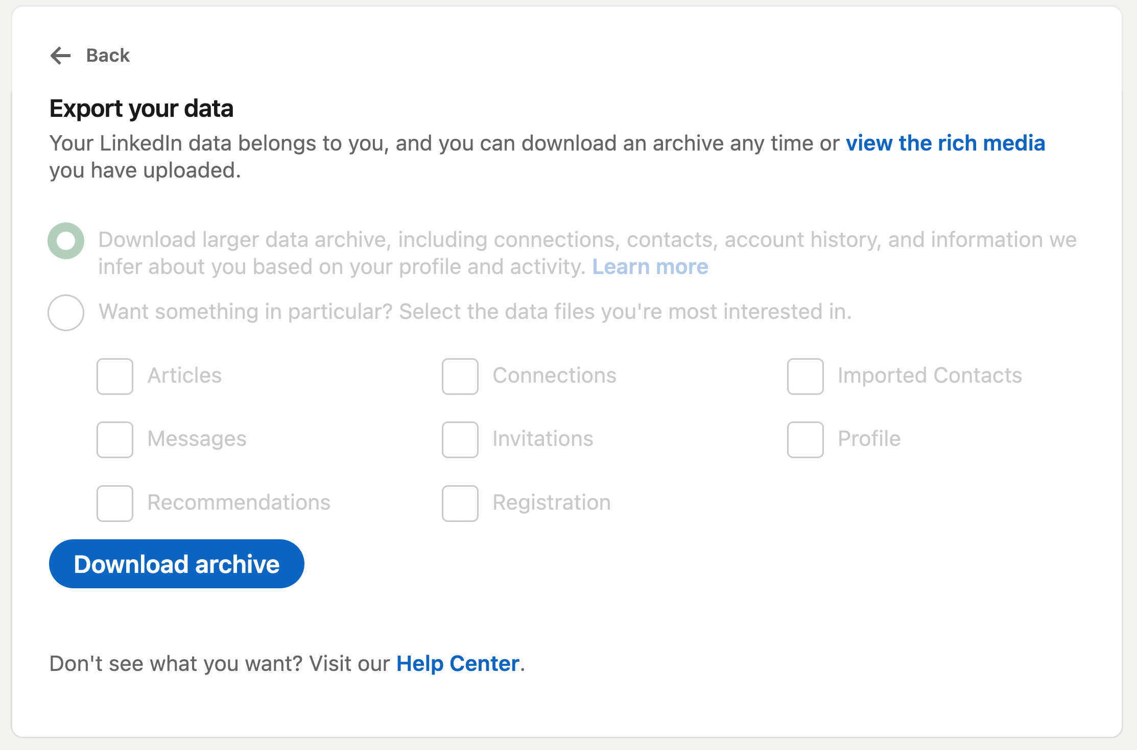
Exporting your LinkedIn data
The first step is getting your data out of LinkedIn. Here's how:
Log into your LinkedIn account
Click on your profile picture and select "Settings & Privacy"
Navigate to "Data Privacy" on the left side
Look for "Get a copy of your data" and click on it
You have two options: download everything, or select specific data

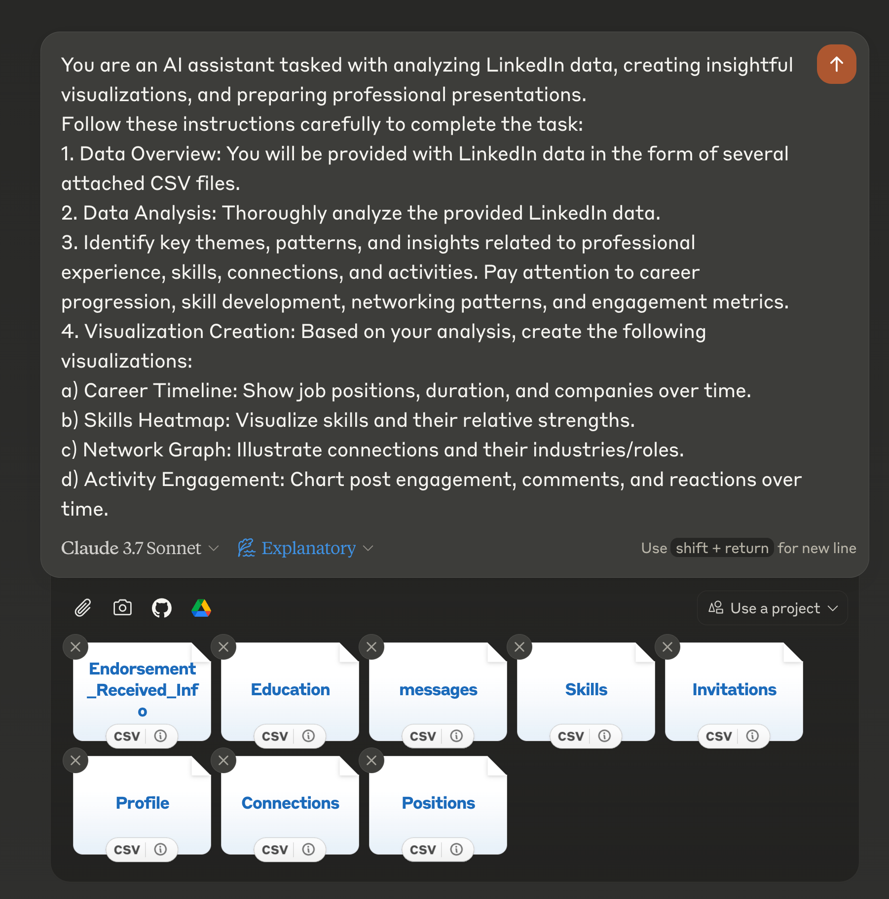
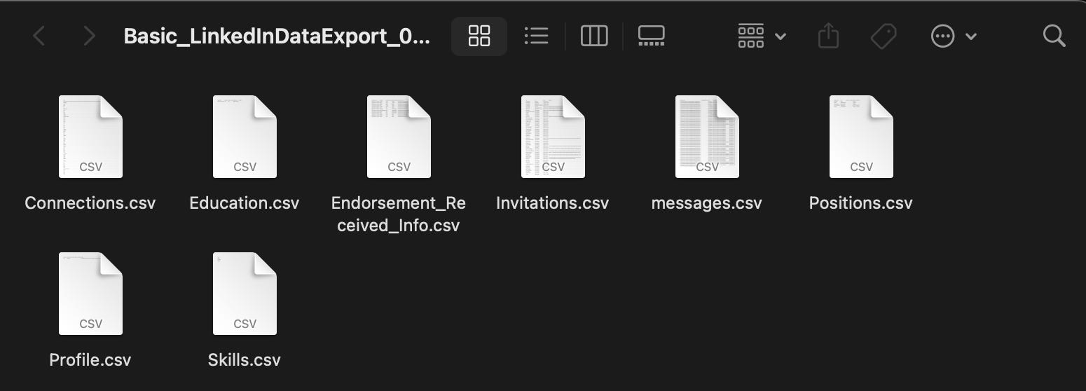
For this visualization project, I recommend focusing on these key files:
Connections
Messages
Profile
Skills
Endorsements
Education
Positions
Invitations
LinkedIn usually takes up to 24 hours to prepare your data for download. You'll receive an email notification when it's ready. Once downloaded, you'll get a zip file containing various CSV files with your data.
Important preparation step: Claude can only work with up to 20 files at once through the web interface. If you downloaded the complete archive, you'll need to clean it up first. Keep only the most relevant files listed above. (Or adjust based on your specific needs.)
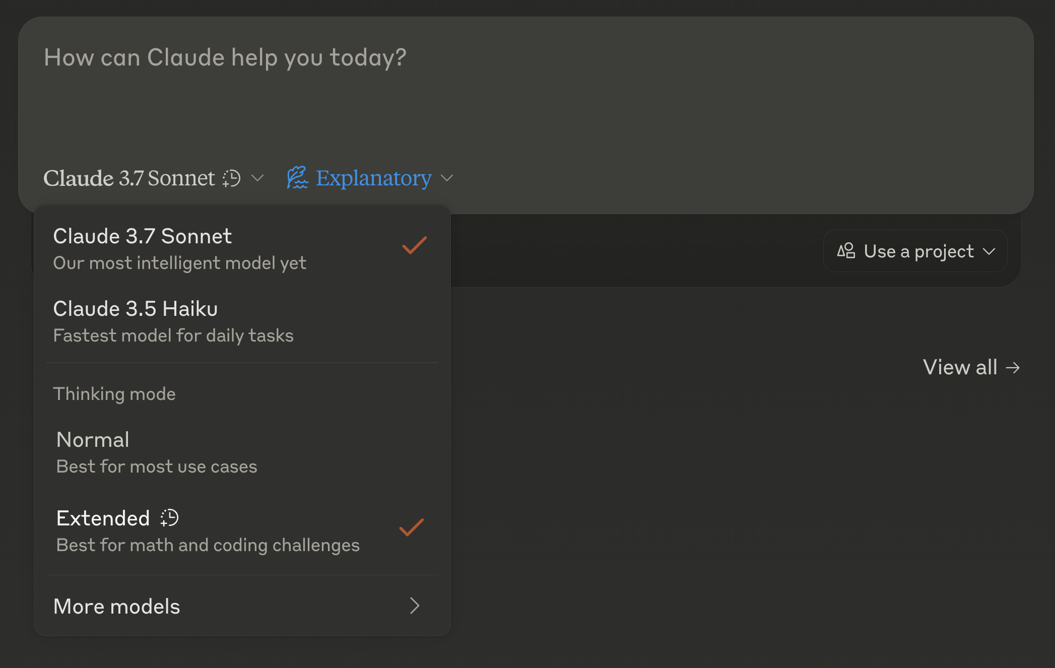
Setting up Claude 3.7 for visualization
With your data ready, it's time to create your visualizations:
Start a new chat in Claude
Select "Claude 3.7 Sonnet" as your model
Enable "Extended thinking" mode (this makes a significant difference in the quality of visualizations)
Upload your LinkedIn data files (up to 20)
Use the prompt template I've provided below
The extended thinking mode is crucial here. It gives Claude time to properly analyze your data and create meaningful visualizations rather than rushing through the process.